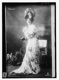
 Welcome back to this long winded tutorial on how to use Photoshop Elements to get a vintage photo ready for the Citrasolv transfer process. Here is part 1 and part 2, which I highly recommend you go through first if you are just joining us.
Today we'll work just a bit more with this vintage photo of Saharet, downloaded from the Library of Congress' Flickr site, my favorite site for copyright free vintage photos.
I do love the photo just as it originally is - with all of it's dust speckles and such, but that much dark ink might not be wanted. We talked in part 2 about isolating your figure, but what if you want to keep some of the background. Choices, choices. I'll show you a few very useful tools that will help you lose some if the darkness of the original photo if that's what you choose to do.
Today's objective is to get rid of as many of the dust spots as we can, then try to boost the contrast as we lighten the background. I have a number of old family photos that I've spent time restoring and these tools are useful to know for that purpose as well. Remember, that you don't have to have the exact same program I do (Photoshop Elements 4.0) to follow these instructions. The commands usually have the same names and if you type them into the Search function in your Help menu at the top of the bar your program will show you where to find what you are looking for.
Step 1 - Crop, Select, Inverse
Using what you learned in parts one and two of this tutorial, Crop out the unnecessary stuff, use the Magnetic Lasso Tool to select Miss Saharet, then click Select, Inverse so that it is your entire background that is now selected.
In this screenshot I've selected the chair along with Saharet and haven't cropped out the frames yet. No worries.
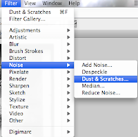
Step 2 - Remove Dust
Now look up in the menu bar for Filter, Noise, Dust and Scratches. This filter is going to find all those white spots and fill them in with the same colored pixels that surround them. You'll see a control panel that looks similar to this.
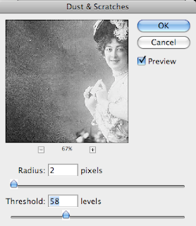
The radius is how many pixels wide your spots are, threshold - ummm. Not sure but since your preview button is on you can see what is actually happening as you slide your numbers back and forth. I think it smooths everything out or keeps edges sharp.
See that percentage number and the - and + signs? Use those to zoom in or out and go ahead and click and drag the picture around until you can see a spot that has some detail and a lot of spots in it so that you can keep an eye on what is happening as you proceed. Remember, if you don't like it hit that friendly Undo arrow and simply try again.
Now that Saharet's background has lost its spots, let's play around with lightening the dark stuff.
Step 3 - Brightness and Contrast
With your select tool still glittering away around the background go ahead and play with your Brightness and Contrast sliders until you're happy with what you are seeing. My objective was to keep the flowers and chair but lighten the background considerably.
Now choose Select then Invert to switch your selection back from the background to your figure. Why do so, you ask? Many times there is more or less light and detail in the figure than the background and they might need quite different levels of adjustment in order not to lose details you want to keep.
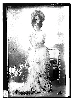
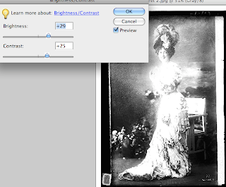 In this example notice that nothing is selected. When I play with brightness/contrast I loose most of the details in her torso long before I lose the darkness in the background. With the figure now selected I can play with contrast and bring her brightness in line with the background, without losing so much detail. So far so good. I could leave it here. (Are you remembering to Save As every so often?)
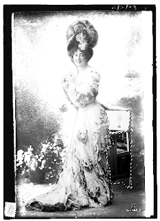 But of course I'm going to keep messing with the photo. That spot under the chair looks like a black hole now. I'll find Select, then Deselect on the menu bar then use the Magnetic Lasso Tool again to outline just the lower, dark part of the chair. This isolates that one area and lets you work just within that space. Again, use the Brightness/Contrast function to mess with the chair until it lightens up to match the rest of the photo. I'm always amazed at the details that are found in seemingly dark nothingness when I use this tool. Can you believe it?
Step 4 - Erase (softly)
 Now I'm finally going to get around to using the Crop tool to get rid of the extra stuff around the borders. You might like those borders which is just fine. When I'm transferring my photocopy onto a piece of white fabric that will be cut and either pieced or fused into a larger composition I like the borders. When I'm transferring the image onto a larger piece of fabric that is not going to be cut down, sometimes I don't want hard edges to box in my image. It's all about choices and there is no one way to do things.
Now find the Eraser tool, set the opacity fairly low and choose a soft edged brush. Smooth over the dark spots around the top and sides until you are happy with what you are seeing. Remember to click often rather than doing this step all in one swoop so you don't have to redo the entire thing if you make a mistake. (Gotta love that undo function!)
Well. There you go! This should give you enough information to spend lots, and lots, and lots of hours playing around with your photos. Over the next few days I'll post some before and after photos that I've messed around with. Thanks for sticking with it!


