Thursday, July 1, 2010

Tutorial: Photoshop Elements for Photo Transfer part 3

Welcome back to this long winded tutorial on how to use Photoshop Elements to get a vintage photo ready for the Citrasolv transfer process. Here is part 1 and part 2, which I highly recommend you go through first if you are just joining us.

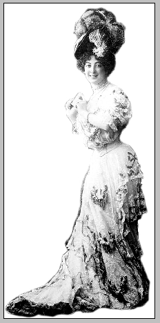
Today we'll work just a bit more with this vintage photo of Saharet, downloaded from the Library of Congress' Flickr site, my favorite site for copyright free vintage photos.

I do love the photo just as it originally is - with all of it's dust speckles and such, but that much dark ink might not be wanted. We talked in part 2 about isolating your figure, but what if you want to keep some of the background. Choices, choices. I'll show you a few very useful tools that will help you lose some if the darkness of the original photo if that's what you choose to do.

Today's objective is to get rid of as many of the dust spots as we can, then try to boost the contrast as we lighten the background. I have a number of old family photos that I've spent time restoring and these tools are useful to know for that purpose as well. Remember, that you don't have to have the exact same program I do (Photoshop Elements 4.0) to follow these instructions. The commands usually have the same names and if you type them into the Search function in your Help menu at the top of the bar your program will show you where to find what you are looking for.

Step 1 - Crop, Select, Inverse
Using what you learned in parts one and two of this tutorial, Crop out the unnecessary stuff, use the Magnetic Lasso Tool to select Miss Saharet, then click Select, Inverse so that it is your entire background that is now selected.

In this screenshot I've selected the chair along with Saharet and haven't cropped out the frames yet. No worries.


Step 2 - Remove Dust

Now look up in the menu bar for Filter, Noise, Dust and Scratches. This filter is going to find all those white spots and fill them in with the same colored pixels that surround them. You'll see a control panel that looks similar to this. 


The radius is how many pixels wide your spots are, threshold - ummm. Not sure but since your preview button is on you can see what is actually happening as you slide your numbers back and forth. I think it smooths everything out or keeps edges sharp.

See that percentage number and the - and + signs? Use those to zoom in or out and go ahead and click and drag the picture around until you can see a spot that has some detail and a lot of spots in it so that you can keep an eye on what is happening as you proceed. Remember, if you don't like it hit that friendly Undo arrow and simply try again. 

Now that Saharet's background has lost its spots, let's play around with lightening the dark stuff.


Step 3 - Brightness and Contrast
With your select tool still glittering away around the background go ahead and play with your Brightness and Contrast sliders until you're happy with what you are seeing. My objective was to keep the flowers and chair but lighten the background considerably.

Now choose Select then Invert to switch your selection back from the background to your figure. Why do so, you ask? Many times there is more or less light and detail in the figure than the background and they might need quite different levels of adjustment in order not to lose details you want to keep. 

In this example notice that nothing is selected. When I play with brightness/contrast I loose most of the details in her torso long before I lose the darkness in the background. With the figure now selected I can play with contrast and bring her brightness in line with the background, without losing so much detail. So far so good. I could leave it here. (Are you remembering to Save As every so often?)

But of course I'm going to keep messing with the photo. That spot under the chair looks like a black hole now. I'll find Select, then Deselect on the menu bar then use the Magnetic Lasso Tool again to outline just the lower, dark part of the chair. This isolates that one area and lets you work just within that space. Again, use the Brightness/Contrast function to mess with the chair until it lightens up to match the rest of the photo. I'm always amazed at the details that are found in seemingly dark nothingness when I use this tool. Can you believe it?


Step 4 - Erase (softly)
Now I'm finally going to get around to using the Crop tool to get rid of the extra stuff around the borders. You might like those borders which is just fine. When I'm transferring my photocopy onto a piece of white fabric that will be cut and either pieced or fused into a larger composition I like the borders. When I'm transferring the image onto a larger piece of fabric that is not going to be cut down, sometimes I don't want hard edges to box in my image. It's all about choices and there is no one way to do things.
Now find the Eraser tool, set the opacity fairly low and choose a soft edged brush. Smooth over the dark spots around the top and sides until you are happy with what you are seeing. Remember to click often rather than doing this step all in one swoop so you don't have to redo the entire thing if you make a mistake. (Gotta love that undo function!) 


Well. There you go! This should give you enough information to spend lots, and lots, and lots of hours playing around with your photos. Over the next few days I'll post some before and after photos that I've messed around with. Thanks for sticking with it!

Tuesday, June 29, 2010

Tutorial: Photoshop Elements for Photo Transfer Pt 2


Welcome to part two of how to use Photoshop Elements to get your vintage photos ready to use for CitraSolv photo transfers. If you are coming in to this process here I highly recommend that you read through part one. Today we'll work on learning to isolate a figure by selecting it, and a little more about erasing and using the brightness/contrast tools.


Remember the lovely Saharet? This is a copyright free image courtesy of the Library of Congress' Flickr site. In the last tutorial I mentioned that while there is great contrast here, too much black ink might bleed. Just for kicks, let's pick Saharet out of her background and use her all by herself. It's a little painstaking but nothing too difficult.

Step 1 - Select

The main tool that we are going to use is a select tool called the Magnetic Select Tool. You can find it on the bar to the right - something that sort of resembles a lasso. Select that then move up to the tool bar on the top. There is enough of a contrast along the edge of the figure that this tool will work wonderfully well. Click the lasso with the Magnet on it. 


Next move over to Feather and decide how fuzzy you want your edges to be. The larger the number you choose here, the more pixels will be included in a fuzzy line around your image. I think I want the edges to be fairly sharp so I'll choose 2 pixels and a width of 2px. Anti-aliasing will make pixelated curves appear sharper so it's a good idea to leave that box checked. Edge contrast makes the dark side of your edge darker and the light edges lighter - again increasing sharpness.

Now use your cursor to slowly go around the edges of the image. You can click as you go to spot glue the line to the more complicated edges. Remember that if your image is a little too small use the Zoom tool. Click to zoom in until you can see your edges clearly.

If you are careful and lucky you can get all the way around your image then double click to close the loop. You should see a flashing dotted line around your image. If your loop disappears entirely click the Undo button (or use Control-Z) to hopefully bring your loop back. Sometimes my fingers get ahead of me and click one too many times and my loop disappears. Yup. The Undo button is my best friend.

If you have a mistake here and there it's not a big problem. Take this little loop for instance. Instead of going back and redoing the entire select process, you can add in that little part to your bigger loop. Hold down the option/alt key while you use the cursor to to loop around that missing part and it will be added to your loop. You should see a little + sign next to the lasso. If you included something that you didn't want to include you hold down the shift key while you use the curser to trace the part you want to exclude. You'll see a - sign this time. 

Step 2 - Invert

Now you have a lovely flashing line around your image. Find the Select drop down and choose Inverse (shift-control-I). This will choose everything around your image. You'll see two flashy dotted lines now. 


Step 3 - Delete
Easy now. Hit the Delete key on your keyboard. The whole background disappears. Cool huh? Now use the Crop tool (see pt. 1) to get rid of all of the extra white space. Finally, go back up to the Select drop down menu and click on Deselect to get rid of all those flashy lines. You can also click Command-D.


Step 4 - Contrast
Now feel free to use the Brightness/Contrast tools we learned in part 1 to punch up the contrast. Keep a balance between dark and light. Or you might like the image just like it is and skip this step altogether. And there you have it.  Miss Saharet all by herself and ready to be transferred.


Stay tuned tomorrow for part 3 and we'll play around with this same image a little more.  I'll show you how to play with contrast and keep the background but lighten it up quite a bit - without losing Saharet in the process. 


Tutorial: Photoshop Elements for Photo Transfer Part 1

The process of moving the ink from a photocopy onto fabric with Citra-Solv is my favorite instant gratification technique in fiber arts. You can find a tutorial on the process here. Sometimes you might have a really wonderful image that isn't quite ideal for the process; either not enough contrast or too much dark ink in the background. Today I'll show you how to punch up the contrast in a photo to help the transfer to come out better.

In the tutorial I posted about choosing an image Miss Maharanee of Kapurthala came out as the best photo because of the plain background that didn't compete with the main image. She does have enough contrast and there isn't too much dark ink. Still - there are some things that you can do to make the image even better.
I'll be using Adobe Photoshop Elements 4.0 for the tutorials this week. It's an inexpensive program and only a couple of years after I bought it, it's up to version 8.0. It does everything that most digital editing hobbyists will need.

I also use Corel's Paint Shop Pro on our family desktop. It's much more powerful but quite a bit less expensive than the full blown version of photoshop. But then - I'm a digital editing junkie.

Don't despair if you aren't using the exact same program I'm using here. Most any inexpensive digital editing program can do what I'll show you today. Just click on help in the upper bar of whatever program you are using and search the function that you need and the program should tell you where it is.

Now - I could use Miss Maharanee just as she is - I like the vintage photo look. But I think I'll isolate her and make her features a bit more clear.

Step 1 - CROP
If I want to isolate Miss Maharanee I might as well get rid of all the extra pixels to begin with. Find your Crop tool - it usually looks something like this. You can also find it under Image on the upper menu bar.

Look to make sure that the Aspect Ratio says No Restriction, for Free Form. Otherwise the crop tool will only let you crop to a standard print size.

Click and drag the box as close to your image as you can without cutting off any parts you want to keep. The part that will be cropped will be grayed out. If you need to move it a bit grab one of the little boxes on the edge of the dotted line with your cursor and drag the box wherever you need it to be. Double click to select and crop the image. 


Now, if you accidentally cropped something you wanted to keep don't panic. Your best friend in digital editing are these two little arrows.  This are the UNDO and REDO buttons and I use them ALL the time! With these two little buttons at your disposal you don't need to fear messing anything up. Just click the little back arrow and it will take you back one step. You can click it as many times as you'd like to get to where you want to be. If you want to try something out and compare steps you can click back and forth as many times as you'd like to. You can also find the Undo button under Edit on the menu bar. The key command Control Z does the same thing. (Command Z on my mac.)


Step 2 - SAVE
Don't forget the most important part - saving your work. My program has the unsettling tendency to quit on my every once in a while right in the middle of a project. If I haven't saved along the way I have to start over. You should save your work every few changes. 

Under File, click Save As. NOT, I repeat NOT, Save. You want to keep your original as is. If you simply click Save you over wright your original file. Not good. Yes, of course you can always click undo until you get back to the beginning and save your work then, but this is less of a pain. Change the name, choose where to save your file, format it as a jpg and click Save. Alternatively, you could leave the name the same and click the As a Copy box if you'd like. 


Now you'll see a box like this. This is important. Slide the Quality button all the way up to the right. If you don't the file will be compressed waaaay too much and your image will be all pixelated. (Ask me how I know.) 

As I work I try to remember to Save a Copy, or Save As with a different name after every main change. That way I can go back to some place I liked and start from there - AND I don't lose my original.

Step 3 - BRIGHTNESS/CONTRAST
Under the menu bar click Enhance, Adjust Lighting, Brightness/Contrast. Make sure the Preview box is clicked on so that you can see what happens as you move the slider back and forth.
Play with both of the adjustments until you find something pleasing to you. 

Here I've boosted the contrast up to about +17. Anything above that and I loose the edge definition on her shoulders. The contrast is boosted to about +19. If I go much above that in this particular photograph I loose some of the definition in her dress. 

There isn't anything magic about these numbers and every photo is different so you really do just need to play with the numbers until you find something you are happy with. Remember that you can always click the undo button if you don't like what you just did. Repeat step 2 - Save.

Step 4 - ERASE
Miss Maharanee is looking pretty good now, but I'd still like to get rid of some of the extraneous stuff around the edges of the photo. There are still smudges and markings that will show up when you make a transfer. I'd rather not have hard straight lines on the outside of my image.

Find the Eraser icon on the tool bar and click it. I want to blur things out gently so I'm going to set the Opacity at about %60. Click on Size in the Eraser Toolbar and move the slider up and down. You'll see a circle on your image that expands or contracts. That's the size of your eraser. I've also chosen a Brush (that's the squiggle next to Size) with fuzzy edges so that I don't get any hard lines from my eraser. Now just brush over the edges, clicking often with your mouse to reset. If you brush for a very long time without reseting you might make a mistake. Then when you undo you have to do the whole thing over. Erase things in short bits and then you only have a little bit to do over.

If you need to get in close to an area, such as the small space above her head you can use the Zoom tool to make the picture look bigger or smaller on your screen. (On my mac's sensor pad I use two fingers to scroll up or down to zoom in or out.) 

I've brushed over all of the edges, and the label that was written in the upper left corner so that now Miss Maharanee is unencumbered by edges of any sort. There is still a little ink around her, softening the image for something of a background fade. What do you think?


Repeat step 2 - Save. Tomorrow I'll continue the tutorial with instructions for selecting and deleting backgrounds entirely, or for boosting the contrast in only certain areas. 

Monday, June 28, 2010

Tutorial: Choosing Photos for Citra-Solv Phototransfer

When you are looking for a photograph to use for Citra-solv photo transfer there are several things to consider. Of course you need to start with a great copyright free image. You can see my post about my favorite source, the Library of Congress here. If you are unfamiliar with the transfer process I'm talking about, or just want a refresher, check the tutorial link at the top of the page.


Consideration # 1 - CONTRAST
The lovely picture of the Baroness De Guestre (below left) captivates me. You know that was one confident and sassy woman just by looking at her! Unfortunately there is not enough contrast in her dress and there is way too much dark stuff all around her hair. Her face blends into the surroundings and her dress disappears. If you squint you'll see a big white space and a blotchy black space. When you transfer the ink to paper or cloth you lose some of the detail so you'll get splotchy black spots on the upper corner and not much on the bottom corner.


The lovely and highly corseted Maharanee of Kapurthala, on the other hand has plenty of contrast in her dress and a plain background that will transfer well and won't compete with the main focus of the image.


Consideration # 2 - TOO MUCH INK
Photos with too much ink

Saharet has enough contrast between the background and her face/dress that you could use the photo just as it is and it would work fairly well. You would know where her face was and be able to see the (also highly corseted) shape of her body. Wouldn't you just love to wear a hat like that?


Unfortunately there is a lot of dark ink. If you transfer your image onto a piece of cotton, a fabric with some absorbency, you will probably be fine. If you are using silk or a synthetic the black spaces, especially in the lower right, have a tendency to bleed and blur. It can be done - but takes a little practice.


Now - there are ways that you can manage to use all three of these photos and make them work. I'll show you some photoshop elements  tricks that will make each photo workable over the next three days. Stay tuned!

Saturday, June 26, 2010

Work in Progress

Some more stitching on my "Family Ties" series.

Gotta say, white on white is hard to photograph.

Had to do some photoshopping to up the exposures.
Any tips for white on white photography would be greatly appreciated.

Thursday, June 24, 2010

Copyright Free Vintage Photos: Library of Congress on Flickr

One of my favorite sources for vintage photographic images is the 


You can search the collections by subject or photographer. They list as much of the history of the photograph as they know. The most important part for artists is that many of the photos are listed as "no known copyright restrictions." Those are the ones you can download and use as you wish. Every day I'm amazed and grateful at how easy the internet has made it to access so many very cool things.

Did you know the Library of Congress also has a Flickr page? Every few days they post several pictures from their historic archives, all of them copyright free. That makes it easier to search for the ones you can use. I get so disappointed when I fall in love with the perfect image then realize I can't use it. The thing I like best about the LOC's Flickr page is the comments from viewers. They often add quite a bit of information to the provenance already listed. I download the largest size they have available. 


Next week I'll post tutorials on what to look for when you want to use a photo for a citra-solv photo transfer how to use Photoshop Elements to make it even better. For now, here is a really great example of what can be found on the Library of Congress' Flickr Site. Pop over there to read the comments too!


Bain News Service,, publisher.
Louis & Lola ?-- TITANIC survivors
[1912 April]
1 negative : glass ; 5 x 7 in. or smaller.

Notes:Title from negative.
Photo taken before the 'orphans' of the Titanic were fully identified. The boys are French brothers Michel (age 4) and Edmond Navratil (age 2). To board the ship, their father assumed the name Louis Hoffman and used their nicknames, Lolo and Mamon. Their father died in the disaster of the RMS TITANIC, which struck an iceberg in April 1912 and sank, killing more than 1,500 people. (Source: Flickr Commons project, 2008)
Forms part of: George Grantham Bain Collection (Library of Congress).
Format: Glass negatives.
Rights Info: No known restrictions on publication.
Repository: Library of Congress, Prints and Photographs Division, Washington, D.C. 20540 USA, hdl.loc.gov/loc.pnp/pp.print
General information about the Bain Collection is available at hdl.loc.gov/loc.pnp/pp.ggbain
Persistent URL: hdl.loc.gov/loc.pnp/ggbain.11222
Call Number: LC-B2- 2486-15 


Where you find your photos?
What do you do with them?