More work in the "Family Ties" series.


 This photo of the beautiful Marion Anderson has too many grey tones to transfer well in the CitraSolv process. Deleting the background then boosting the Brightness and Contrast removes enough ink that we can get a great transfer - keeping the details in her face.
 It's a common problem when trying to transfer photos of any dark skinned person. This little cowboy also has an awful lot of stuff to compete with in the background of his photo. I deleted the background then selected certain areas such as his face to boost more or less than other areas. Now that I'm looking at it I see that I've blown out (made too bright) all the detail in his chaps.

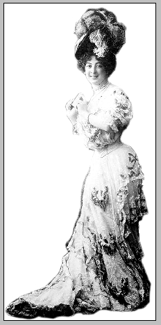
 I used the Zoom tool to blow the picture up quite a bit for better visibility. Next I used the Erase tool at 100% opacity to outline the Baroness. There isn't quite enough contrast between her dress and the background for the Magnetic Lasso tool to be effective. Once she's got an outline then I used the lasso to select her, Invert the selection, and Delete the entire background.
 I carefully used the Magnetic Lasso Tool to select just her face and body then played around with Brightness and Contrast. I used the command and the shift keys to add and subtract areas to the selection before I did so.
 Welcome back to this long winded tutorial on how to use Photoshop Elements to get a vintage photo ready for the Citrasolv transfer process. Here is part 1 and part 2, which I highly recommend you go through first if you are just joining us.


 In this example notice that nothing is selected. When I play with brightness/contrast I loose most of the details in her torso long before I lose the darkness in the background. With the figure now selected I can play with contrast and bring her brightness in line with the background, without losing so much detail. So far so good. I could leave it here. (Are you remembering to Save As every so often?)
 But of course I'm going to keep messing with the photo. That spot under the chair looks like a black hole now. I'll find Select, then Deselect on the menu bar then use the Magnetic Lasso Tool again to outline just the lower, dark part of the chair. This isolates that one area and lets you work just within that space. Again, use the Brightness/Contrast function to mess with the chair until it lightens up to match the rest of the photo. I'm always amazed at the details that are found in seemingly dark nothingness when I use this tool. Can you believe it?
 Now I'm finally going to get around to using the Crop tool to get rid of the extra stuff around the borders. You might like those borders which is just fine. When I'm transferring my photocopy onto a piece of white fabric that will be cut and either pieced or fused into a larger composition I like the borders. When I'm transferring the image onto a larger piece of fabric that is not going to be cut down, sometimes I don't want hard edges to box in my image. It's all about choices and there is no one way to do things.


 Now use your cursor to slowly go around the edges of the image. You can click as you go to spot glue the line to the more complicated edges. Remember that if your image is a little too small use the Zoom tool. Click to zoom in until you can see your edges clearly.
 If you are careful and lucky you can get all the way around your image then double click to close the loop. You should see a flashing dotted line around your image. If your loop disappears entirely click the Undo button (or use Control-Z) to hopefully bring your loop back. Sometimes my fingers get ahead of me and click one too many times and my loop disappears. Yup. The Undo button is my best friend.
 If you have a mistake here and there it's not a big problem. Take this little loop for instance. Instead of going back and redoing the entire select process, you can add in that little part to your bigger loop. Hold down the option/alt key while you use the cursor to to loop around that missing part and it will be added to your loop. You should see a little + sign next to the lasso. If you included something that you didn't want to include you hold down the shift key while you use the curser to trace the part you want to exclude. You'll see a - sign this time.

 Step 3 - Delete
 Step 4 - Contrast